Hart to Hart Childcare Center
BRAND IDENTITY · ART DIRECTION · ILLUSTRATION · BRAND COLLATERAL

Reimagining a neighborhood childcare brand with a warm, playful identity designed to inspire trust, curiosity and connection.
THE BRIEF:
Hart to Hart had built a warm, family-centered childcare experience, but its visual identity needed to better reflect the personality of the center and the quality of care behind it. The goal was to create something fresh and contemporary without losing the familiarity and warmth that families already associated with the brand.
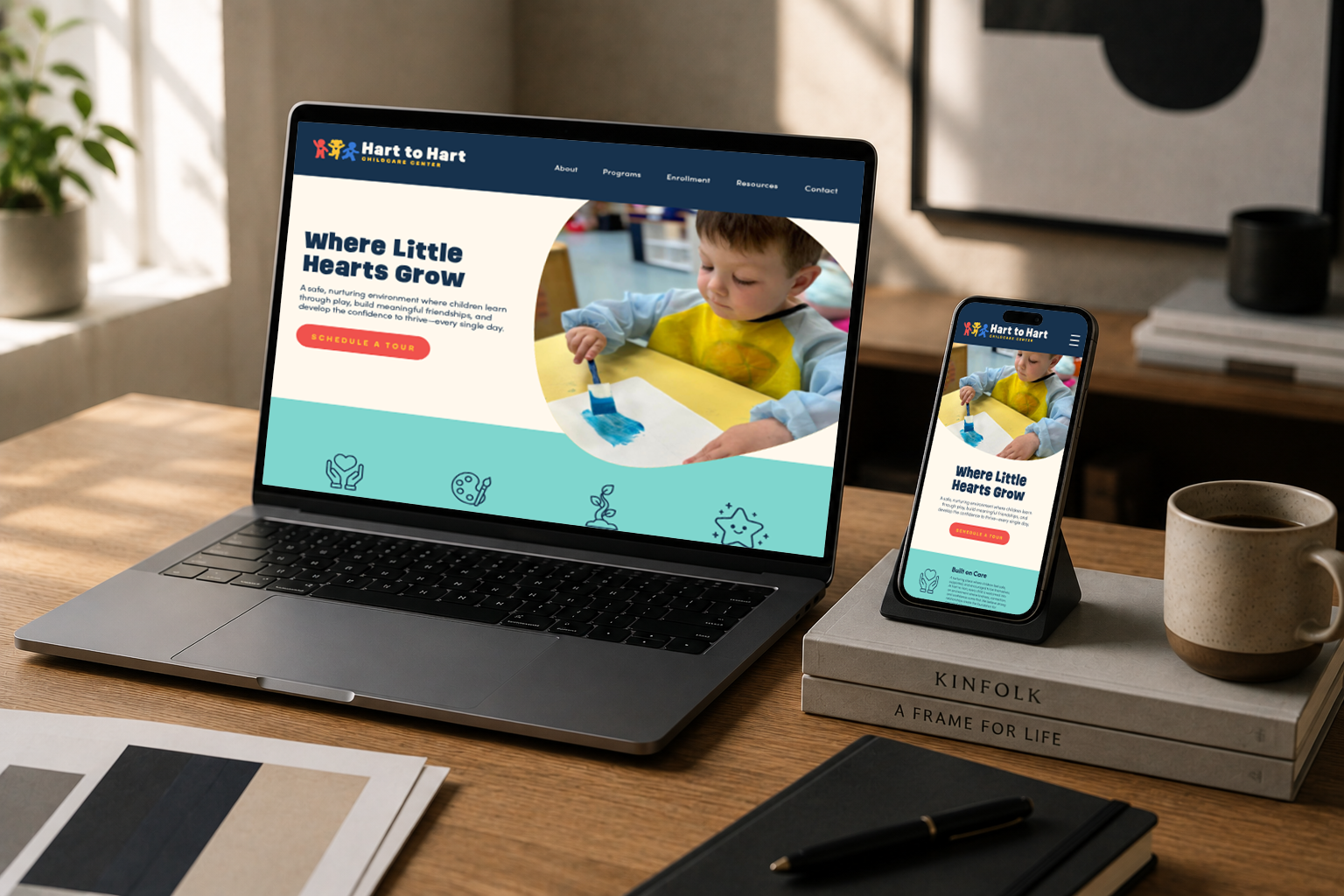
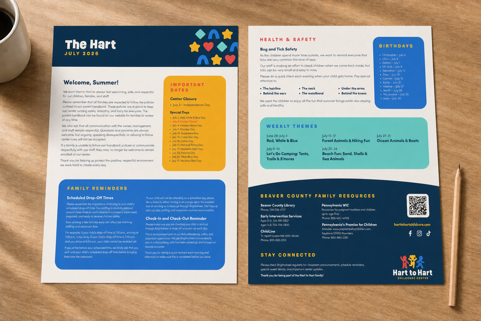
The new identity needed to feel playful enough to connect with children, reassuring enough to earn parents’ trust, and flexible enough to work across everything from everyday communications to signage, apparel and digital content.
THE APPROACH:
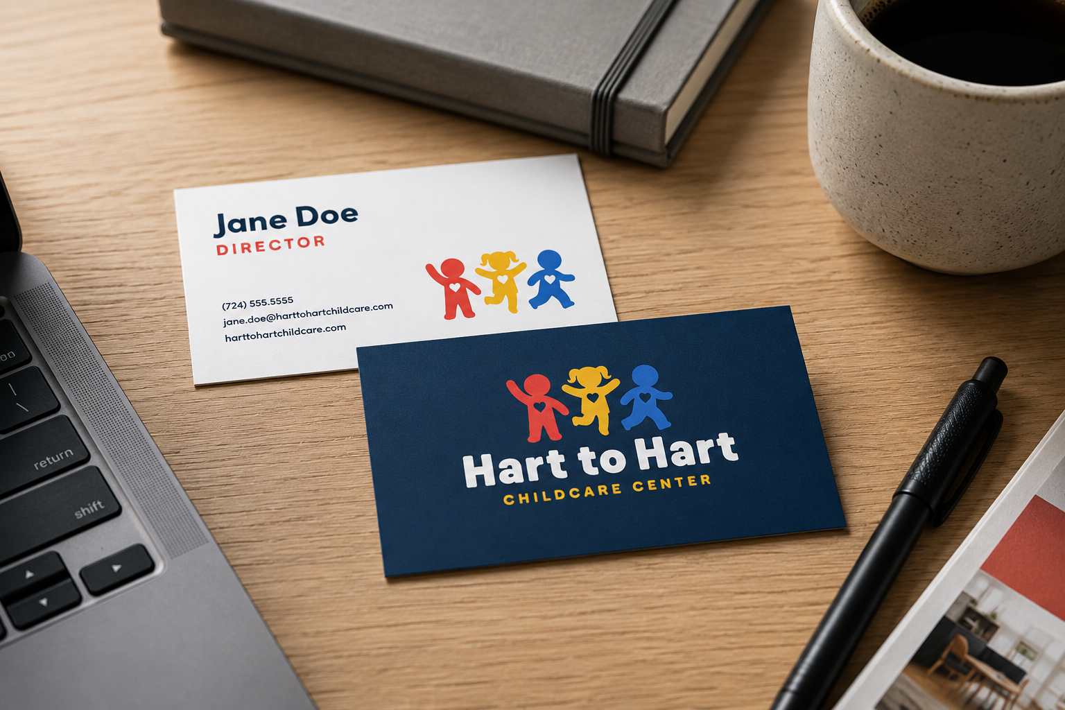
Rather than relying on the familiar visual clichés of childcare branding, the identity was built around simple forms, expressive color and a sense of connection. The logo brings children together in a friendly, recognizable mark, supported by approachable typography and a flexible visual language that balances youthful energy with a more considered, modern feel.
THE RESULT:
A warmer, more contemporary identity that reflects the personality of Hart to Hart while giving the brand room to grow. Playful without becoming juvenile and polished without feeling corporate, the system creates a distinctive visual presence built around the same qualities at the heart of the center: care, connection, curiosity and growth.